East Palo Alto Community Archive
I led my team at Idea 2 Form through the process of designing and building an accessible, comprehensive, multilingual digital archive website, collaborating with community leaders throughout the process.Role: Product Designer
Team:
Team:
- Brand Designer - Lexx Valdez
- Visual Designer - Mar Trava
- Communications Lead - Rey Robles
- Backend Engineer - Danny Cen
- Frontend Engineer - Edith Cauich
- QA Analyst - Marja Chiquini
- Solutions Architect - Alejandro Michell
- Engineer consultants - Basecodeit
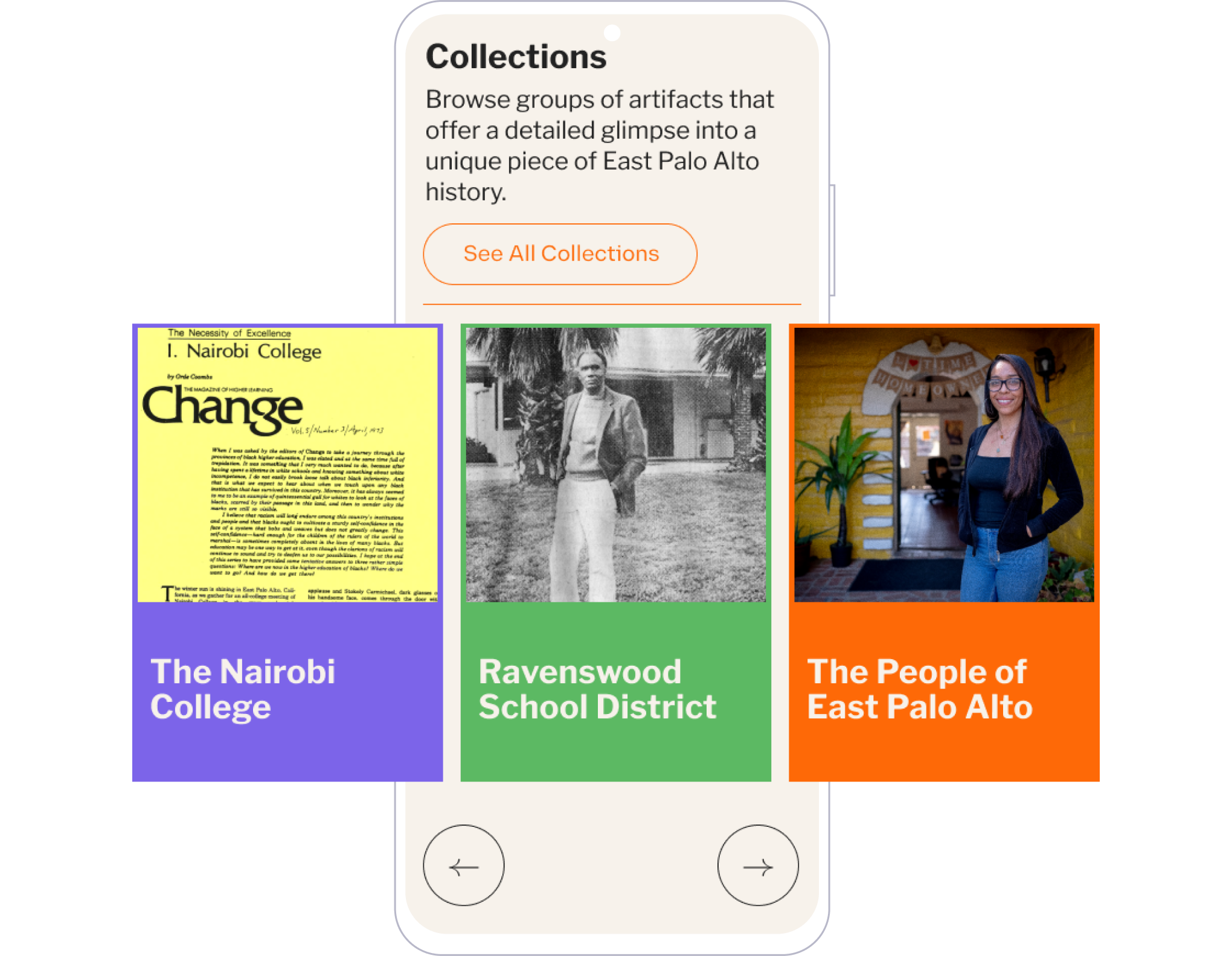
Client: The mission of the East Palo Alto Community Archive (EPACA) is to collect, share, promote, celebrate, and preserve the unique history of East Palo Alto, California for future generations.
Scope: My work was part of a full-service strategy including a new brand, social media strategy and assets, photo and video capture, archive database infrastructure, and archive website.
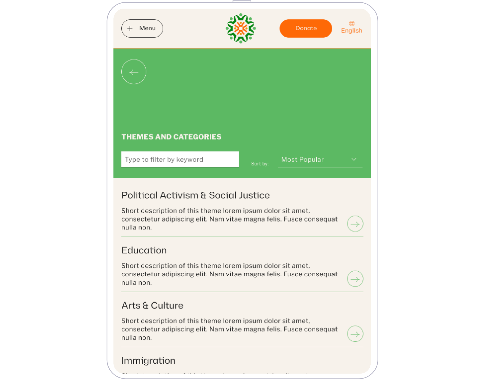
The Challenge
- We needed to design and build sustainable, user-friendly systems from the ground up for 1) storing archive data, 2) showcasing archive materials, and 3) allowing people to submit new archive materials.
- The archive must be accessible to an extremely diverse audience in terms of age, cultural background, and comfort with digital technology.
- Earning community leaders’ trust was required for authentic collaboration and project success.
The Opportunity
- The East Palo Alto community has strong leadership, vision, and sense of self. A diverse group of volunteers from the community who are committed to the archive’s success had already been established.
- East Palo Alto’s unique and beautiful history quickly captured the hearts of our team!
What the community needed was a partner who respected and valued the unique history and character of East Palo Alto to build the brand and technical foundation for an archive that will last for many generations.
The Solution
I designed and facilitated a series of weekly participatory design workshops with community members.
Together, we created website goals, personas, and user journeys.

Impact: We had several voluntary participants at each session, and they reported feeling informed and listened-to. Participants take pride in the website and their impact on the site’s final design and organization.


I tested designs with participants using task analysis at each stage, including card sort, wireframes, mockups, and the live site.
Impact: During testing, we succeeded in each of the website metrics we co-created at the start of the design process.
We asked testing participants, “how much you agree or disagree with the following statements using a 1-5 rating, where 5 is strongly agree and 1 is strongly disagree” with the following average scores:
4.4 / 5
The archive website feels welcoming.
The archive website feels welcoming.
4.7 / 5
I found what I was looking for quickly and easily.
I found what I was looking for quickly and easily.
4.7 / 5
The website visuals look contemporary and depict a community with a proud history.
The website visuals look contemporary and depict a community with a proud history.
4.1 / 5
The website presents East Palo Alto as a multicultural community with global connections.
The website presents East Palo Alto as a multicultural community with global connections.


A page from our design system
See the Live Website ︎︎︎
Check out another project:
Ashoka
I managed the design and product evolution of Ashoka’s international, multilingual drupal product Ashoka.org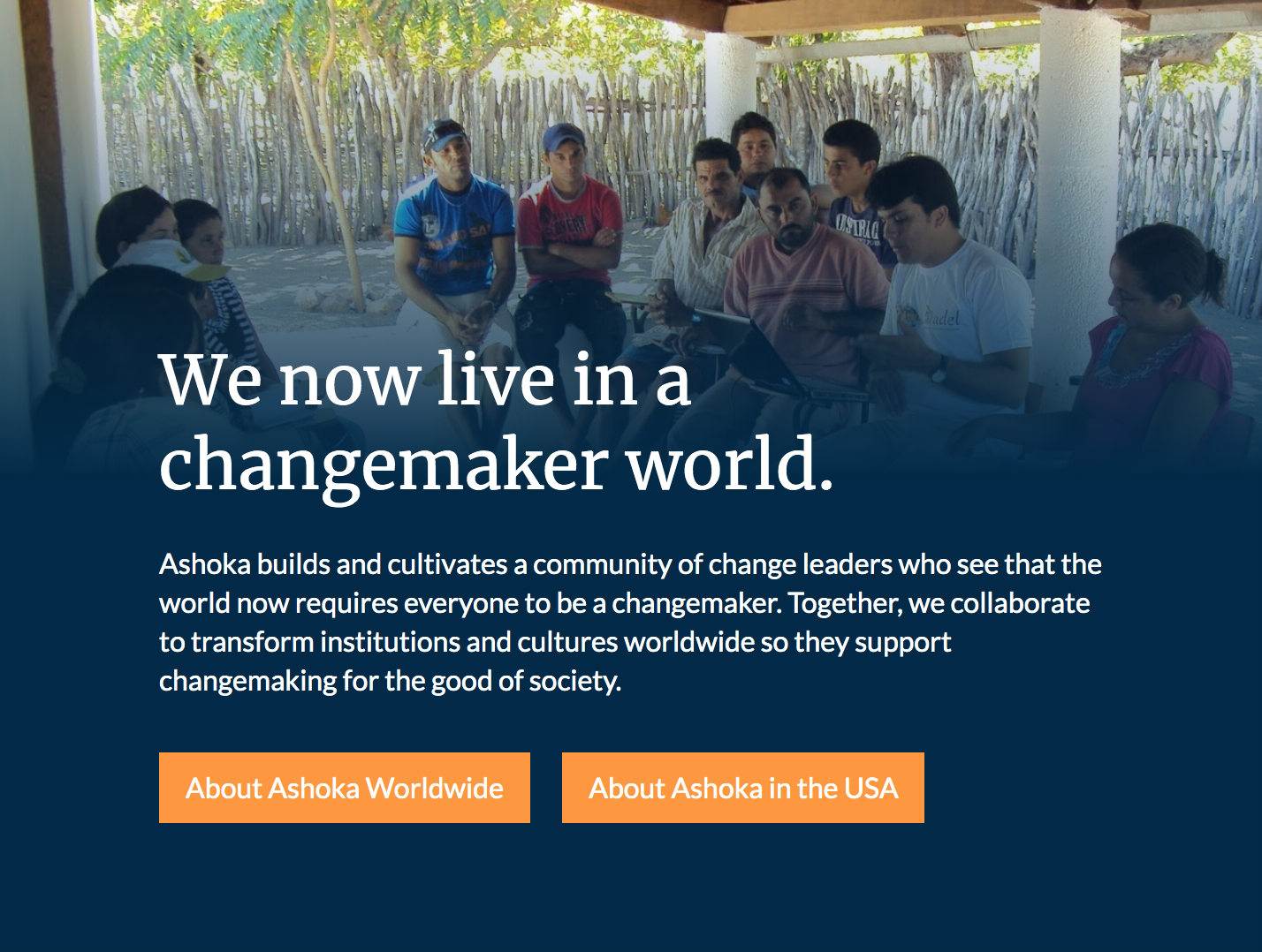
Role: UX Designer to Product Lead
Company: Ashoka recognizes and connects social entrepreneurs around the world to accelerate social change.
Company: Ashoka recognizes and connects social entrepreneurs around the world to accelerate social change.
Team:
- Visual Design Consultant (direct report) - Mi Nguyen
- Communications Lead - Hasan Bhatti
- Engineering Lead - Jaya Jayanth
- Backend Engineer - Dipak Yadav
- Frontend Engineer - Sonal Sangale
The Challenge
Ashoka has more than 30 semi-autonomous offices around the world. Many of these dispersed teams have developed their own visual style and launched their own sites and communications staff are underresourced across the organization.
The Opportunity
- There is a lot of expertise inside the organization. If we were better connected we could learn a lot from each other and build upon the same projects.
- The small communications staff are passionate, skilled, and open-minded leaders.
The Solution
I created and managed my team’s first agile sprint process and product roadmap, cutting our new feature response time by 50%.
- Strategic sub-teams: I organized our team into content, design, and build sub-teams each with its respective leader. I led the design team and managed two contractors.
- Data-driven prioritization: I met with the team leads and the Director of Information Technology in order to prioritize our roadmap based on internal client demand and analytic data.
- Clear documentation: I kept our roadmap organized in Jira and Confluence, and shared it with both the team and the wider organization.
- Tracking progress with sprints: I managed weekly sprints to track progress towards our goals.
Trust in our team greatly improved as we became more responsive to new feature requests.
I led in creating Ashoka’s first design system and compontnet library, and led in creating Ashoka’s first brand style guide in a decade.
- Breaking down silos: I organized an international working group of comms staff who were previously siloed from one another to collaborate on global design needs.
- Emptathetic listening: I took the time to learn about the design challenges teams around the world are facing, and helped understand our overlapping priorities.
- Transparent processes: Our working group signed off on our updated style guide and the design system available in Figma.
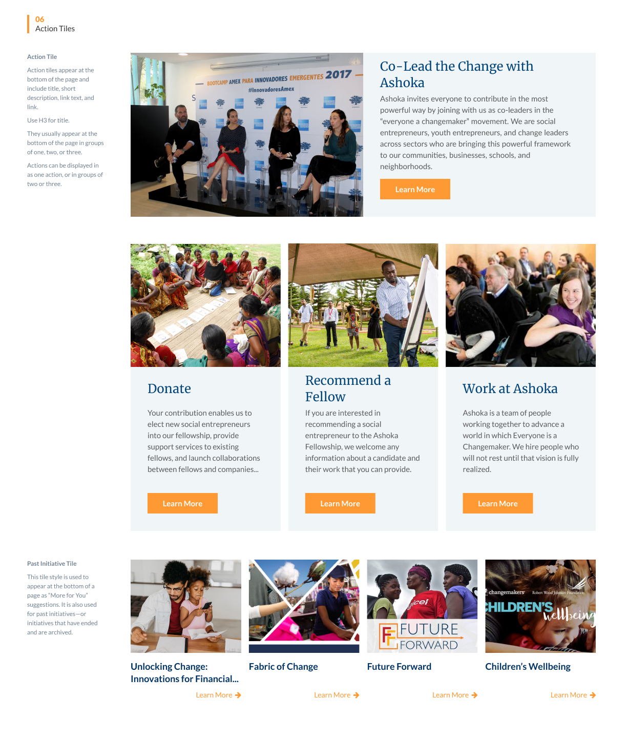
A section from our interactive design system
I redesigned Ashoka.org’s most visible pages, resulting in visitors spending 12% longer per session on average on the website.
- Component-based pages: Using our new design system, I designed flexible components that our stakeholders used to improve the About and Home pages.
- Collaboration with developers: I worked closely with engineers to ensure the design system and updated brand colors reflected the components in their Drupal library.
Analytic data demonstrated the success of the designs:
Returning users increased by almost 10%
Visitors were more likely to remain on the website after the visiting the first page
Visitors viewed more pages per session
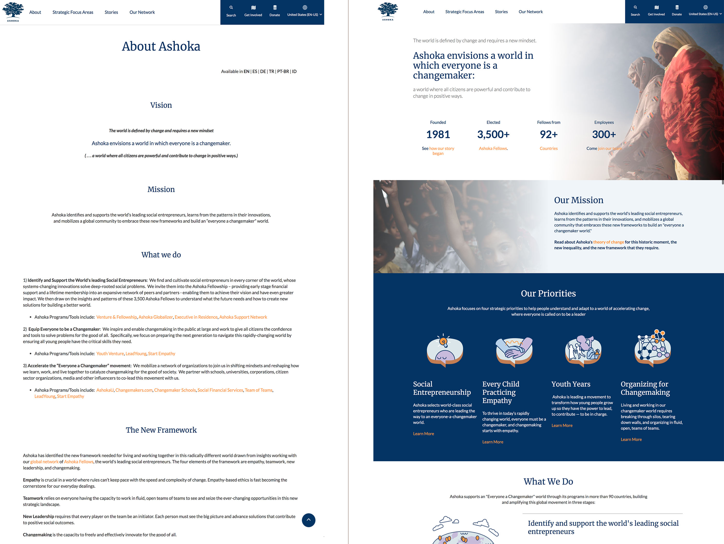
About Ashoka page before and after redesign
Visual Design
I was responsible for designing and editing components for our design system that could be used in flexible ways for our internal clients’ diverse needs.

A sample sub page using several banners, tiles, and other patterns that I designed
Check out another project:
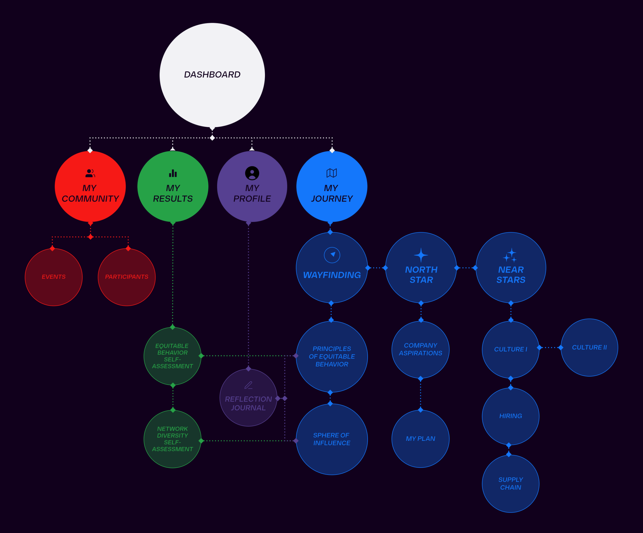
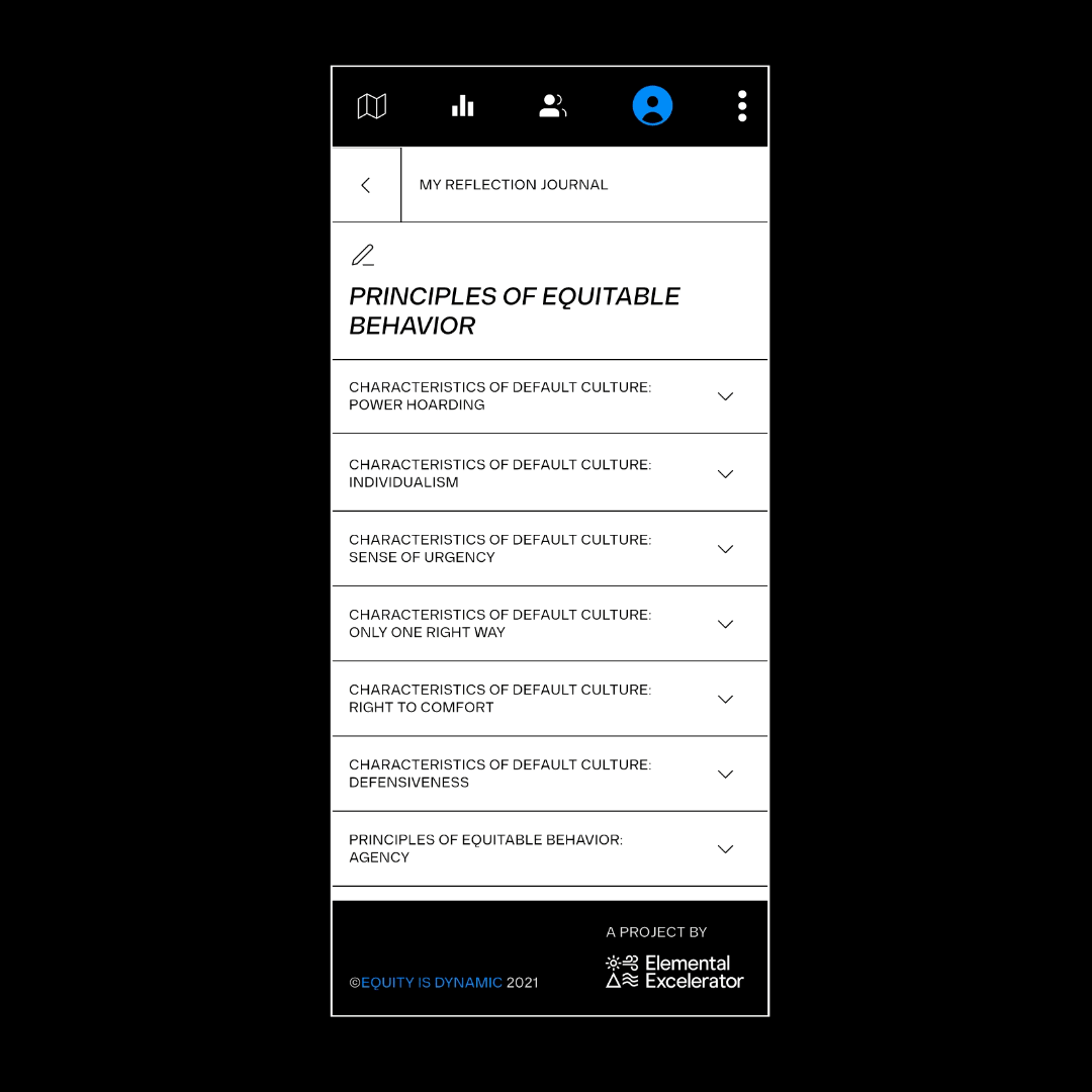
Equity is Dynamic
I co-created an e-learning mobile web application that helps climate tech leaders develop and deploy equitable practices in their companies.My team at Idea 2 Form partnered with Elemental to create Equity is Dynamic, an e-learning web application that helps companies prioritize and measure their progress towards their diversity, equity, and inclusion goals.
Role: Product Designer / Content Strategist
Team:
- Brand Designer - Lexx Valdez
- Visual Designer - Mar Trava
- Project Manager - Falon Shackelford
- Backend Engineer - Danny Cen
- Frontend Engineer - Edith Cauich
- Solutions Architect - Alejandro Michell
- Engineer consultants - Basecodeit
- Nathaly Moreno (client) - Copy editing
The Challenge
- Limited capacity: Elemental’s prestigious accelerator program could only accommodate about 2% of the hundreds of interested applicants.
- Inaccessible learning content: To expand the reach of the program, they asked us to create a website where anyone could access the learning materials. However, the learning materials were dense, and difficult to understand without context.
- Minimal tech infrastructure: The client had never created an application before and was unfamiliar with the process and did not have a product infrastructure in-house.
The Opportunity
- Powerful content: Even small parts of the base workshop content had so much to offer our target audiences.
- End user access: We had access to a group of people who were already interested in the product.
- Collaborative partnership: There was mutual partnership with the client, and we worked together as one team.

The Solution
1. Product Strategy
I worked with our Solutions Architect to develop and present a proposal for an MVP e-learning application, to guide users through the otherwise dense and inaccessible learning materials.-
Created a rough timeline for releases
- Collaborated with our Visual Designer to apply the new brand design to a proof of concept
- Gave our client contacts the data they needed in order to pitch this idea to their leadership
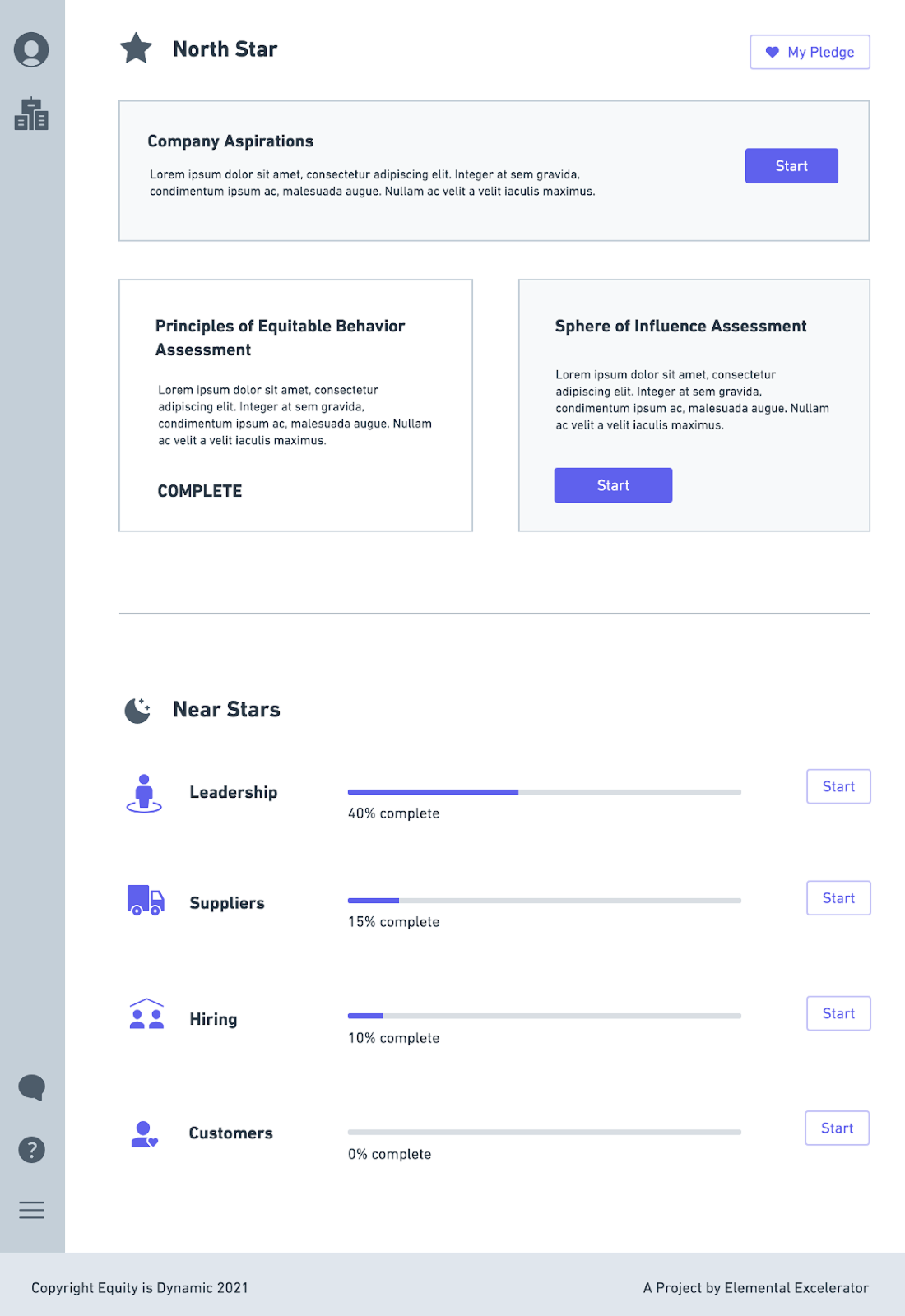

My wireframe for an early dashboard prototype used in our proposal
2. User Research
After our proposal was approved and we solidified OKRs and product requirements, I conducted user interviews both with individuals who went through the accelerator and past applicants in order to create personas and journeys.![]()
3. Content Strategy
I worked closely with Elemental’s Equity and Access Innovation Manager Nathaly Moreno to translate workshop content into learning modules. 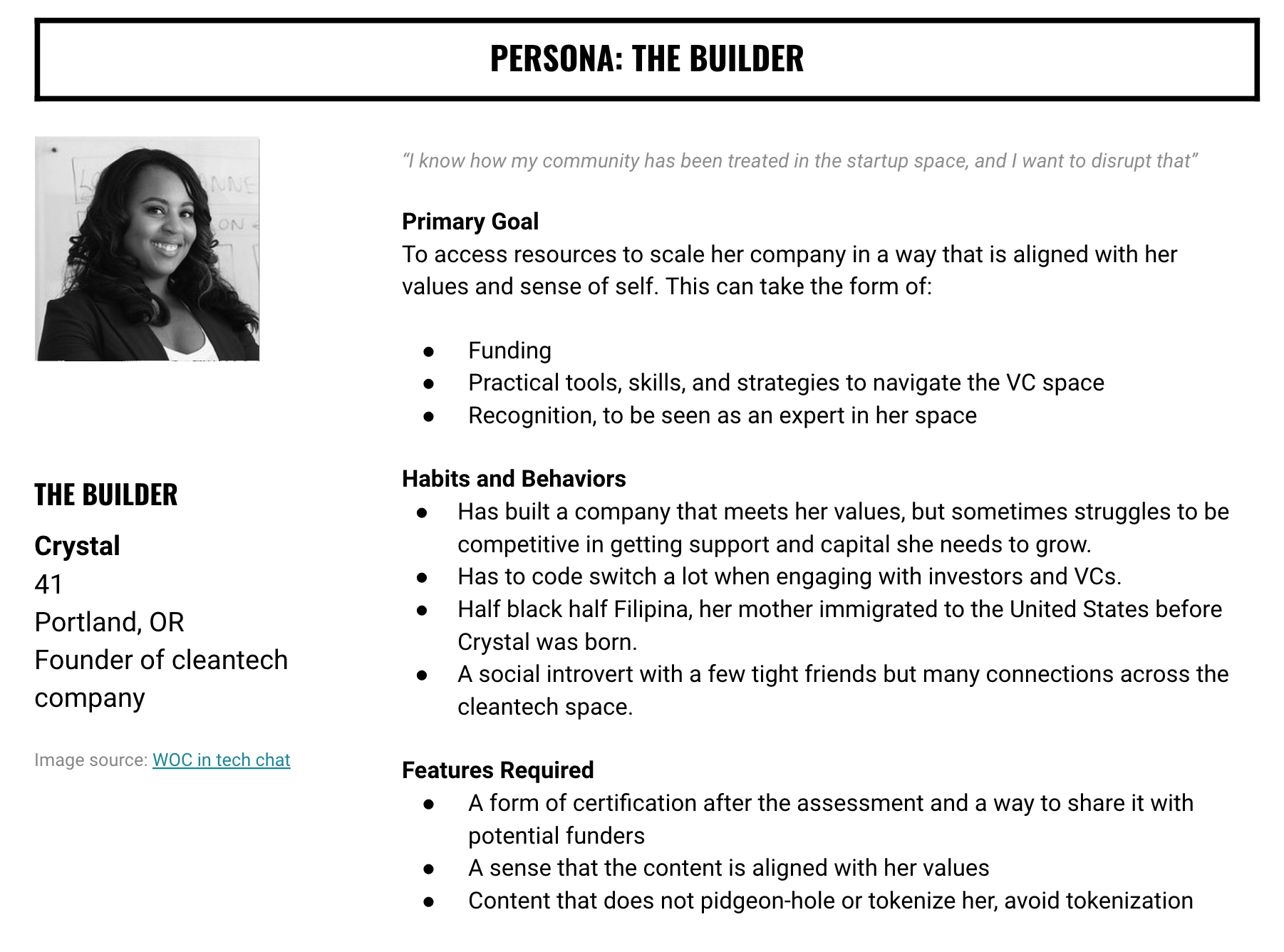
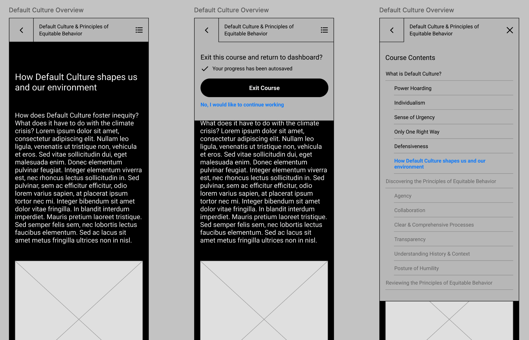
4. Mobile design wireframing and prototype testing
I designed wireframes for our MVP launch, including two learining modules, a dashboard, a log in landing page, and a simple tutorial. We prioritized the mobile design, and then desktop and tablet designs came later.
I created and executed a testing plan to ensure ease of use and document enthusiasm about the product.
5. High-fidelity prototyping
I presented wireframes to the engineers to ensure scope viability, and after confirming, delivered the designs to our visual designer for high fidelity mockups.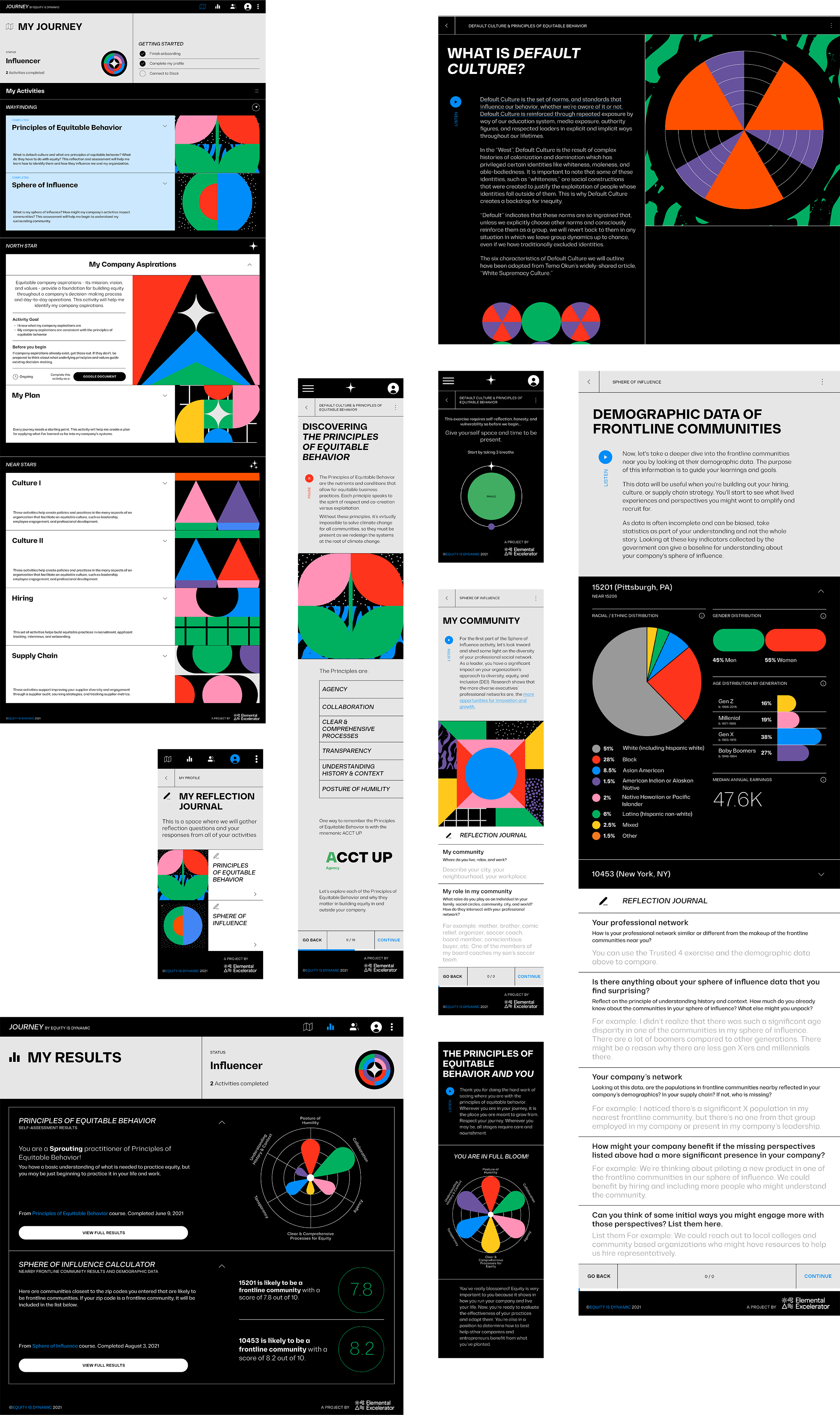
6. QA testing, User Acceptance Testing, and launch
After supporting the engineering team throughout the build, and testing and reporting bug fixes, I created and executed a testing plan with end users.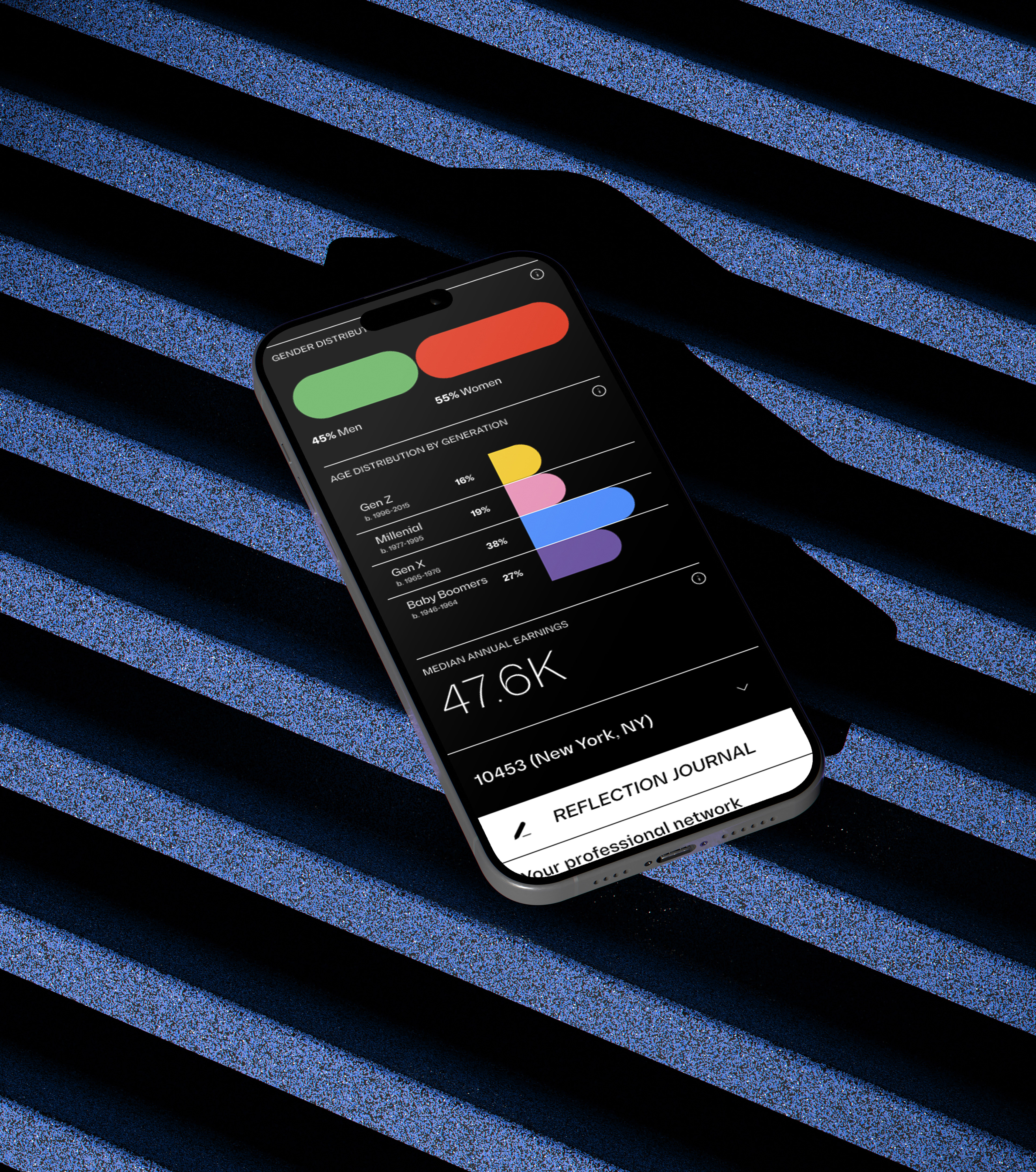
Check out another project:
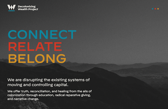
I did the audience mapping, content strategy, and UX design for Decolonizing Wealth Project’s website.
Decolonizing Wealth Project (DWP) is an indigenous-led initiative centered around using wealth, reparations, and radical giving to repair and heal individuals and communities.
The Challenge
- The organization has powerful ideas but they needed to be made more accessible.
- The organization has multiple fundraising programs, a shop, and thought leadership to share.
- The website needed to be easy to navigate for unique audiences: funders, grantees, and collaborators.


The Solution
I led the client through identifying key audiences and testing designs in order to create more accessible language and layouts.
- I interviewed members of the target audience to develop personas.
- I worked with our business strategy lead and a content editor on the client side to streamline language.
- I tested wireframes with members of the target audience to ensure it was easy to navigate.
- I collaborated with my team’s Visual Designer to apply the brand.
I led my team through user acceptance testing and launch of the new website.
-
I collabroated with developers to ensure usability, seamless navigation, and accuracy of design.
- I created a launch timeline and managed communication between my team and the client.
See the Live Website ︎︎︎
I did visual design, UIs, and graphics for MicroStrategy’s business intelligence analytics software.
I worked on our most visual and popular product in 2014, Visual Insights, when we were transitioning from Flash to HTML5 and CSS3.
Visual Insights Toolbar Redesign
I used paper prototypes, task analysis, and collaborated with UX designers to produce a stronger, cleaner interface that inspired applause at our annual client event.
Toolbar before redesign:

Toolbar after redesign:

Wireframes
Task analysis
